Activity: Compare Fandom Data
Using fandom data provided on Archive of Our Own, compare and contrast two fandoms in terms of the most popular characters, the most popular relationships, and the politics entangled in these representations. Below, I created a video that shows a step-by-step guide for this process.
This activity has several goals:
- Learn how to read and interpret AO3 metadata,
- Introduce how to use a spreadsheet editor, like Excel, to collect and visualize data,
- Practice analyzing quantitative data through a critical lens.
Introduction
This activity builds upon Fandom Stats and Destination Toast. Fandom Stats visualizes and shows the statistics of a particular fandom, such as how many works are published, the ratings used, and the most popular categories. Similarly, Destination Toast performs descriptive statistics on particular fandoms and writes brief analyses. Fandom Stats is interactive, while Destination Toast is a blog site. These two sites for statistics demonstrate, first, basic understandings of AO3 metadata practices, and second, how descriptive statistics can be used to better understand fandoms and fan politics.
For this activity, you will follow along with Destination Toast’s post “How do I find/gather data about the ships in my fandom on AO3?” Destination Toast uses AO3’s “Sort and filter” function in each fandom to map out the most popular relationship categories.
Example for Scaffolding
Let’s say I am interested in the representation and inclusion of Black characters in fandoms. I may choose two popular movies where at least one main character is Black: Star Wars (Sequel Trilogy) and Black Panther. I followed Destination Toast’s guide for using the “Sort and filter” function on the right side and collected the raw counts of the top 10 character information.
Data Description and Download
On October 15th, 2020, I collected the data in this spreadsheet, which can be used to practice quantitative analysis and visualizations with Excel or a similar spreadsheet editor. If you do not have access to Excel, other spreadsheet editors like Google Sheets use similar functions. I have made it into a CSV (comma-separated value) file, which can be opened up on any spreadsheet editor.
Download sample CSV file here!
A CSV file is a data file that does not contain hidden formatting, unlike an Excel file. There are four columns: the name of the fandom, the character’s name, and the raw count of the top 10 characters used in this fandom. I also included an extra row for each fandom to include the total number of fandoms. This way, you can also calculate percentages.
Here are some discussion questions to move use as you practice calculating percentages and creating charts:
- Who are the most popular characters for each fandom?
- Which character is, percentage-wise, the most popular character used in their fandom? Who is the tenth most popular character used in their fandom and why?
- Which characters are you surprised to find on this list of top ten characters? Why?
- How may you assess racial politics in the two fandoms?
Fandom-specific questions
- Why may Kylo Ren/Ben Solo appear so often and with different aliases? How does this impact the data collection and analysis?
- Why do you think Armitage Hux so popular? Why do you think Finn, Leia, Luke, and Rose are less popular?
- Why do you think certain Avengers characters appear in the Black Panther fandom?
- Why might Nakia be less popular in the Black Panther fandom?
Calculating Percentages
When making arguments based on which characters are used in fanfics more often, a stronger argument comes if you incorporate percentages, not raw numbers. Currently, the CSV file only has raw numbers. Percentages, though, shows you how often a particular character appears in relation to the amount of fanfics published in that fandom. For instance, Star Wars has a lot more fanfics published than Black Panther, so looking at percentages to compare the two fandoms is much more effective.
To calculate percentages, open the .CSV file in Excel. Create a new column for percentages by writing “Percentages,” in cell D1. As I mentioned, I included the total number of fanfics published for each fandom (row 2 and row 13). You will use these numbers to calculate the percentage of how often particular characters appear. The equation for calculating percentage looks like: (Part/Whole) x 100. In order to calculate this in Excel, you can create your own function! To signify to Excel you are creating a function, go to a blank cell and type the equal sign (=). Then, you can put in your calculations.
Because Excel is a spreadsheet editor and can calculate a mass amount of numbers automatically, you can input just the cell ID instead of a number for your calculation. So, if you want to calculate the percentage that Rey appears in the Star Wars Trilogy, you would write in cell D3 (Rey’s empty percentage cell):
= (C3/C2)*100 (then press “Return” or “Enter” on your keyboard)
What you are doing here is telling Excel to divide the total Star Wars fics published (C2 = 62784) by the number of fics Rey appears (C3 = 32231) and multiply that result by 100, which is how you calculate percentage. The C3 and C2 indicate the cells with which you’re pulling data from. This way, if you update information, your calculation updates along with it. You can then do this for each character! This video visualizes these instructions:
Creating Charts
Excel is great for creating charts. Sometimes creating charts are literally just as easy as highlighting data and clicking “Recommend Charts.” One important piece of information to know, though, is that the placement of data is important for chart creation. To easily create a chart using the “Recommended Charts,” follow these steps:
- Copy all the data from Column B (“Character”).
- Right click Column D (“Percentage”) and choose “Insert Copies Cells.”
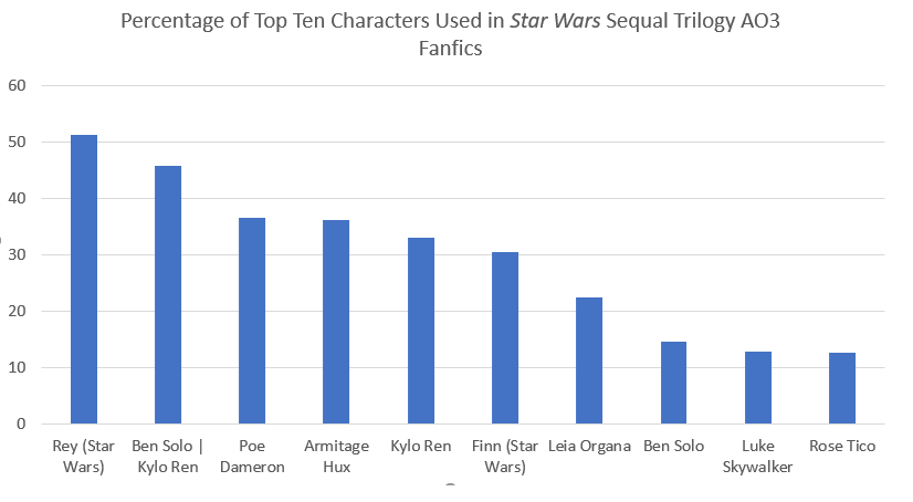
- Highlight the information you want to graph. Let’s start with the Star Wars Trilogy. Highlight the Sta Wars character names and percentages (D & E) from row 3, where Rey’s data is, to row 12, where Rose’s data is. This way, you highlight both the “Character” and the “Percentage” (Figure 1).
- Go to “Insert” on your toolbar.
- Click “Recommended Charts” and choose which you prefer. The bar graph is always an easy, but effective choice!
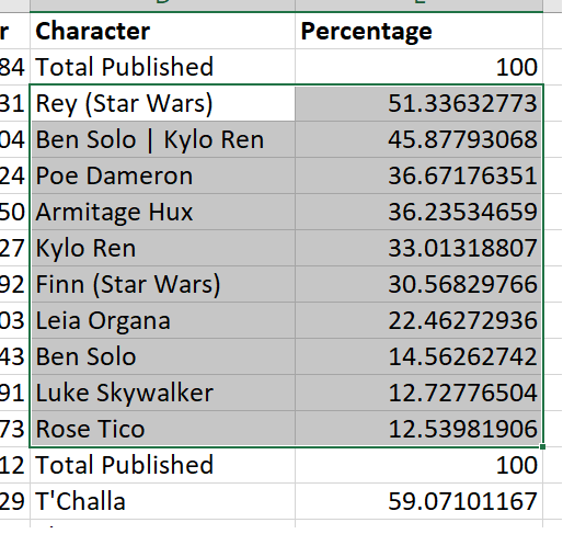
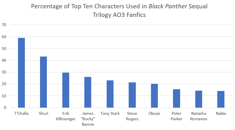
Now you should have a chart that looks like Figure 3. I changed the title by double-clicking the title and adding my own descriptive title. You can do the same thing for the Black Panther data, too (Figure 2 & 3)!
Your Turn!
Now that you have the basics down of working with spreadsheet data and have a model for how to create data, it is your turn to make data based on two fandoms! Before choosing your fandoms, think about what critical lens you may want to apply such as feminist, anti-racist, queer, or disability representation. These lenses, of course, can overlap! I am also including a video (below) with a step-by-step guide for finding the correct AO3 metadata, building your data, and creating charts.
Choose Your Fandom
Once you choose a lens you want to analyze two fandoms through, choose your two fandoms. These fandoms may be from canons that are similar or canons that are very different. Answer this question:
- Why did I choose these two fandoms? How does it relate to your critical lens?
Choose Your Metadata
Once you choose your fandoms, choose the top metadata you want to analyze. You can go by character, relationship, or additional tags. And, as Destination Toast shows, you can even nuance your choices further! For example, maybe you are interested in which characters are used most for “F/F” Relationship categories in a fandom and which characters are used most for “M/M” relationships in the same fandom. Once you have made this choice, answer this question:
- Why did you choose to analyze the particular metadata you chose? How does it relate to your critical lens?
Create Your Dataset
Open a new Excel or spreadsheet editor and create a dataframe similar to the one we worked with. Create three columns: fandom name, character/metadata information, and raw count. To do this, you can copy each character’s name -- or whatever metadata you use -- and also copy the raw counts. Make sure to this file. Then, calculate your percentage and create at least one chart for each fandom. Think about these discussion questions using the other two questions you answered:
- Describe the context around these results.
- How are the fandom metadata practices similar or different in these two fandoms?
- Describe these two fandoms through your critical lens.